Fog of War: Mapping the Information Landscape
Fog Of War is a transformation of US mainstream news articles into an interactive geographic map. Regions correspond to trending news topics, allowing the user to explore news cycles, illustrating which stories are covered most as well as illuminating those stories which are left untold.
View the Project Here | Github
Abstract
News is how citizens make sense of the world outside of immediate, local, sensory experience. As the world becomes more interconnected, the prominence of local issues fades and large scale and systemic issues dominate. Journalism’s role of informing the public and serving as the “fourth estate” of robust democratic decision making becomes increasingly important. However, journalism is far from a perfect, even handed information source - it must inevitably choose, curate, and disseminate only those stories it deems newsworthy. Inherent in the New York Times’ slogan that it contains “all the news that’s fit to print” is the admission that “the map is not the territory.” But what is the map? This project is an interpretation of what it would mean to create an all-encompassing map of news, both to give a perspective on what topics were ultimately covered most as well as what stories were ultimately left untold. Over 1 million US headlines published over the course of 2020 were collected, clustered by topic, and transformed into a terrain map of the information landscape. Heavy news coverage brings mountains into prominence, connected stories are bridged by land, while small narratives and threads lapse into chains of islands. The map reflects the landscape throughout time, shifting the positions of continents and sizes of mountains, allowing the viewer to follow stories as they morph throughout the news lifecycle.
Video Presentation (ITP Thesis Week 2021)
Technical Summary
Data
MediaCloud indexes mainstream US media content. The first version of this project uses a 77,100 headline selection from the month of February, 2020.
Clustering
The next step is to cluster the headlines together to extract the topics. There are a number of unsupervised topic modeling approaches which generally use a strategy of trying to find sets of words that often occur within the same document. LDA, is probably the most well-known example. However, I chose to use a newer method, GSDMM, which is specifically designed for short texts (like tweets, or news headlines), although at it’s core it uses a similar technique of looking for common word-occurences. I didn’t do any rigorous evaluation, but a cursory, subjective comparison of the two models seemed to suggest that GSDMM’s cluster outputs made more sense to me and better represented different “news topics.”
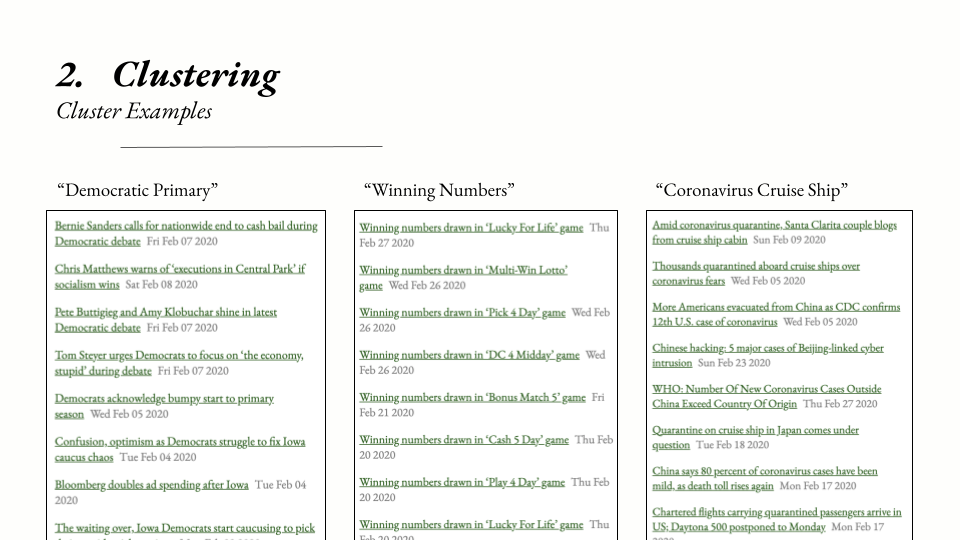
The above slide shows some examples of headlines for a few GSDMM topic clusters from the dataset. Since the model is unsupervised, the algorithm isn’t able to label any of the topics automatically - it’s up to a human observer to identify a meaningful label for each topic. In these cases, it’s fairly straightforward: the left-most topic cluster contains headlines that all have to do with the Democratic primary elections, the center cluster contains headlines that contain lottery winning number announcements, and the right-most cluster contains news regarding various cruise ships impacted by COVID-19.
This set of examples highlights the strengths and weaknesses of the text-clustering algorithm. Since it’s based purely on words (and does not draw on any latent semantic information, eg on word2vec embeddings or similar), all “COVID-19 cruise ship” news is grouped together, despite there being distinct news coverage of different cruise ships. Some non-cruise ship COVID-19 news also is able to sneak into the COVID-19 cruise ship news cluster, presumably because most stories about cruise ships contain words like “death”, “cases”, “quarantine”, etc. While the clustering technique isn’t perfect, it’s a decent place to start to extract meaningful groups of news headlines.
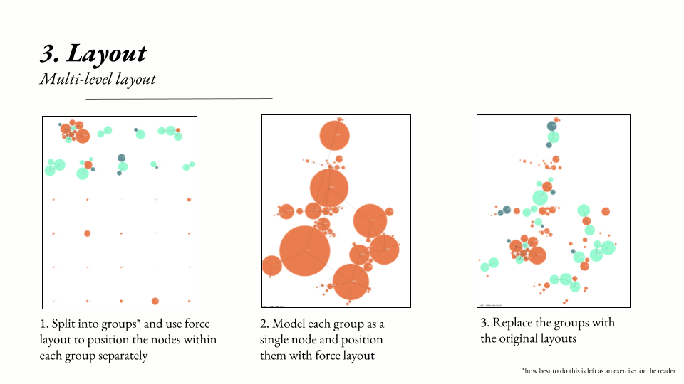
Layout
The third step is to lay out the topics in a two dimensional space. I want related topics to be close together, and unrelated topics to be further apart.
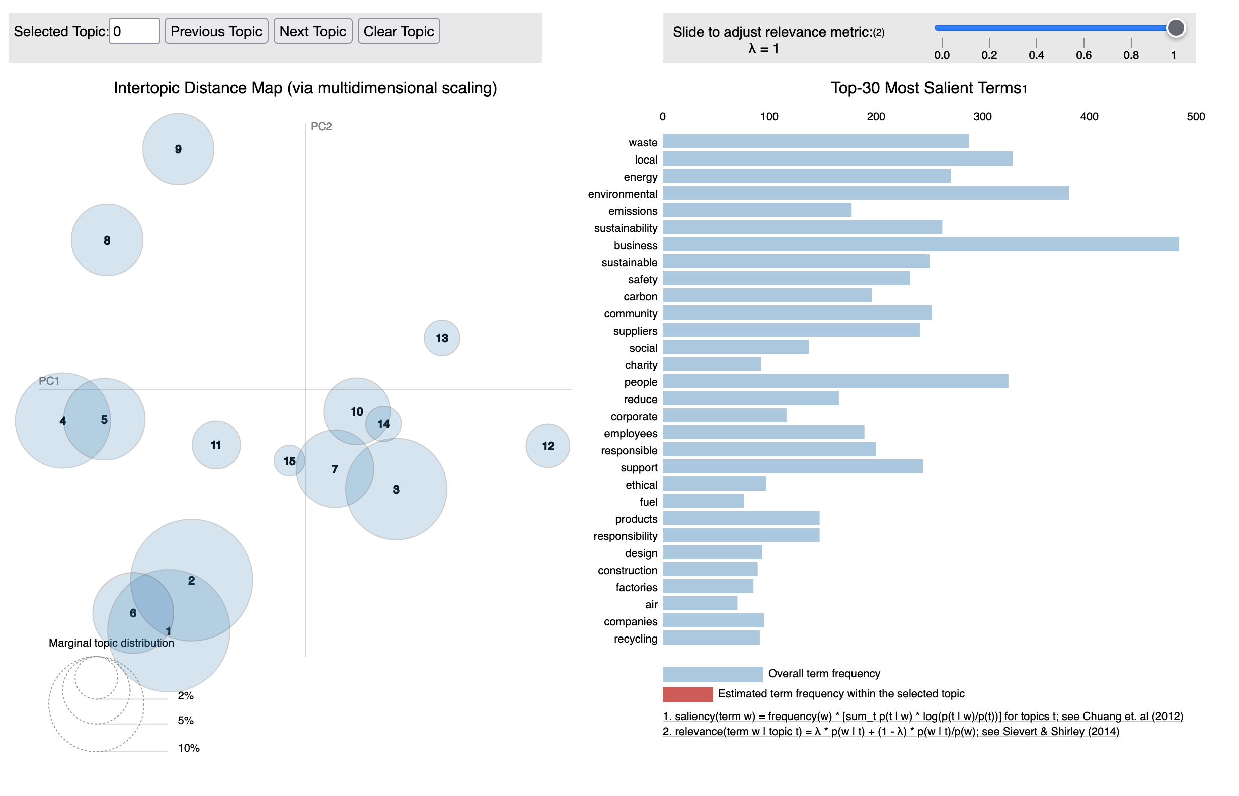
The existing project LDAVis, a tool for researchers to quickly interpret the results of topic models, lays out topics in a two dimensional space, grouping similar topics close together. However, I want my news map to be usable for folks without an understanding of token salience, lambda parameters, and so forth. In addition, LDAVis’s layout algorithm (multidimensional scaling) is relatively naive, is computationally expensive with a large number of topics, and doesn’t always place topics that I judge as similar near each other, or places unrelated topics close together.
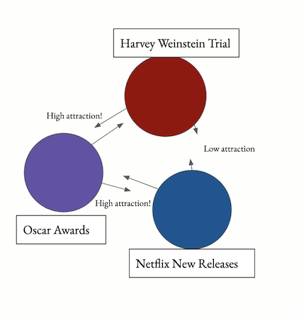
However, I can utilize the similarity measure of LDAVis - the Jensen-Shannon divergence. The missing component is how to lay out the topics while attempting to preserve distances (inversely) proportional to their similarity scores. For example, consider a topic cluster containing headlines on the Harvey Weinstein trial has a relatively high similarity score to a topic cluster on the 2020 Oscar award ceremony, which has a high similarity score to a third topic cluster about new movie releases on Netflix. Ideally, Weinstein’s cluster would be placed closely to the Oscar awards cluster, since his trial and sexual harassment investigations were often discussed in conjunction with his outsized role in the Oscars. However, his trial has less to do with new movies on Netflix.
I settled on a force-directed layout scheme, where an attractive force is assigned to topic clusters similar to each other, and a repulsive force is assigned to topic clusters further away. Force layout schemes are common in network visualizations, where many nodes and many edges need to be laid out in 2D space. In my case, topic clusters were the nodes, and each cluster had a (weighted) edge between it representing the similarity score between the two clusters.
However, a nontrivial amount of tweaking and pruning of the cluster network was required to get a usable layout. First, I deleted low-similarity edges from the graph. I care less that the distance between unrelated clusters is exactly proportional to their degree of non-similarity: it’s more important that they are simply not near each other. Second, I used min-cut graph techniques to isolate highly connected clusters from each other, and then used a second iteration of force layout to position these clusters.
I began to think of these second-order clusters as continents, with the topic clusters inside of them as regions or countries. For example, several highly connected topics formed a “continent” of political news. Several other highly connected topics formed a “continent” of coronavirus news. These two continents are also similar, given the politicization of the virus even in February of 2020, and so the continents are placed near each other in the second-level force layout. Meanwhile, a third “continent” of sports news can be placed further away from both the politics and coronavirus content.
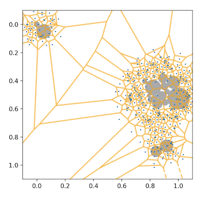
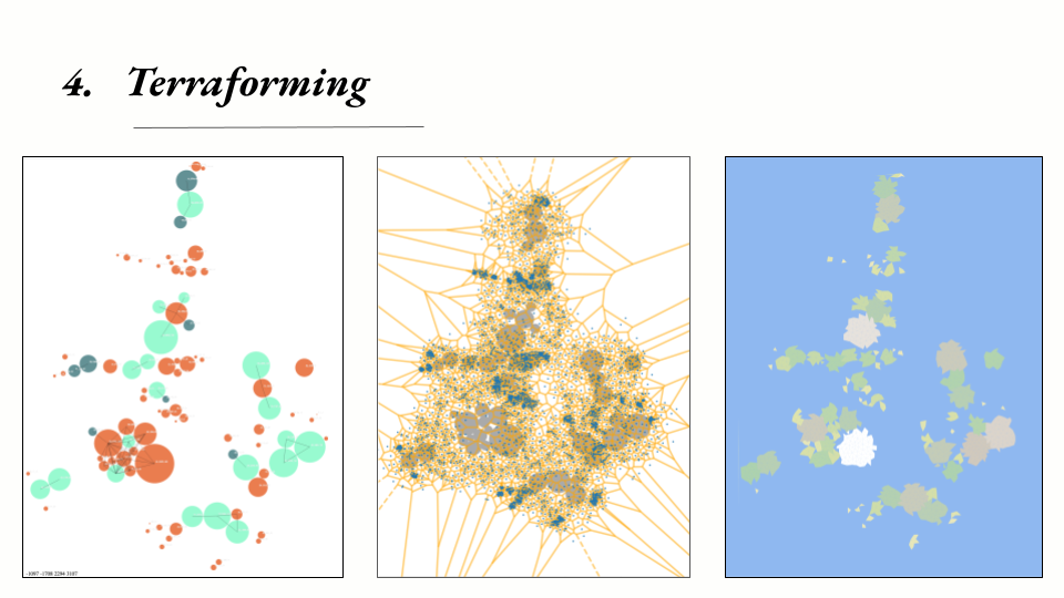
Terraforming
The fourth step is converting the network layout to geography. So far, each cluster has been modeled as a circle, but perfectly circular countries aren’t so visually engaging. I used a classic map-generation technique: I placed points (shown in blue) randomly over the 2D space, then generated the Voronoi polygon set over those points (borders shown in yellow). Polygons whose origin point lay within a topic cluster’s original circle become land, while the remaining polygons become water.
Label Generation
The final step is to generate names for each region. Each GSDMM topic comes with a set of words most commonly found for each topic cluster. I use a simple tracery grammar to combine the prominent words for each cluster with map words such as “peninsula,” “cape,” “mountains,” etc. based on the number of adjacent regions (eg, “island” would only be assigned to regions with no neighbors).
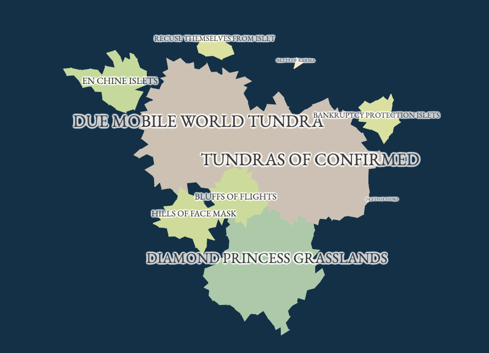
The Final Map
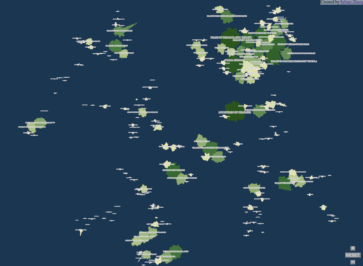
The final map is composed of 160 different regions and is fully zoomable, clickable, and explorable. You can explore it yourself here.
For me, exploring the map reveals both latent connections and under-surfaced news stories. For example, while it may be expected that coronavirus news and political news are related to each other, the map also shows that discussion of the economy, the price of gold and stocks, is highly connected to discussions of coronavirus in the mainstream media, perhaps more so than discussion of its human impact.
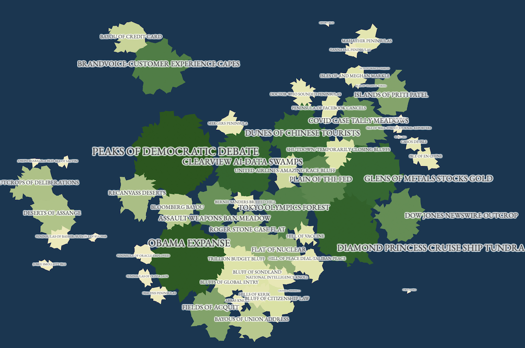
At the same time, the fact that even small topics are visible as small islands, as opposed to being buried underneath the flood of news, allows them to be explored and surfaced in a new way. The map showed, for example, a set of stories on the state of California’s official apology for Japanese internment; something meaningful that didn’t get picked up so much in the news cycle but still very much worth surfacing.
Future Work and Acknowledgements
I learned a ton of stuff from working on this project, from the history of journalism to unsupervised NLP techniques to network force-layout strategies. There are a ton of improvements I hope to make: automatic label generation (this seems quite difficult honestly), automated deploys of current data (the existing prototype is frozen to February 2020) to name a few.
Software/Technical Acknowledgements:
MediaLab and The Berkman Klein Center, Rwalker’s implementation of GSDMM, D3’s force layout package, and Mewo2’s terrain generation tutorial
Special Thanks:
Mimi Yin, Kat Sullivan, Emily Zhao, Christina Dacanay
References:
Lippmann, Walter, and Michael Curtis. Public opinion. Routledge, 2017
Chomsky, Noam, and Edward S. Herman. Manufacturing consent: The political economy of the mass media. London: Vintage Books, 1994.
Mir, Andrey. “Postjournalism and the Death of Newspapers.” The Media after Trump: Manufacturing Anger and Polarization. Available online: https://www. amazon. com/dp/B08GWWXDG7 (accessed on 16 April 2021) (2020).
Jacobs, Alan M., J. Scott Matthews, Timothy Hicks, and Eric Merkley. “Whose News? Class-Biased Economic Reporting in the United States.” American Political Science Review (2021): 1-18.
Benkler, Yochai, Robert Faris, and Hal Roberts. Network propaganda: Manipulation, disinformation, and radicalization in American politics. Oxford University Press, 2018.
Sign up for the mailing list
Comments